GOT PILLS?
Pill Drive Poster Series
PROJECT INFO
DURATION
2 Weeks, Fall 2018
SKILLS
Typographic Hierarchy
OVERVIEW
If you can't design a basic poster, you can't be a successful designer.
This series is a design exercise where I redesigned a poster four times from RIT Campus, advertising a pill disposal drive. The original was busy and difficult to figure out the information for the event.
I was given different type constraints for each redesign, but all of them had to be in black and white and use little to no imagery.
My Final Designs
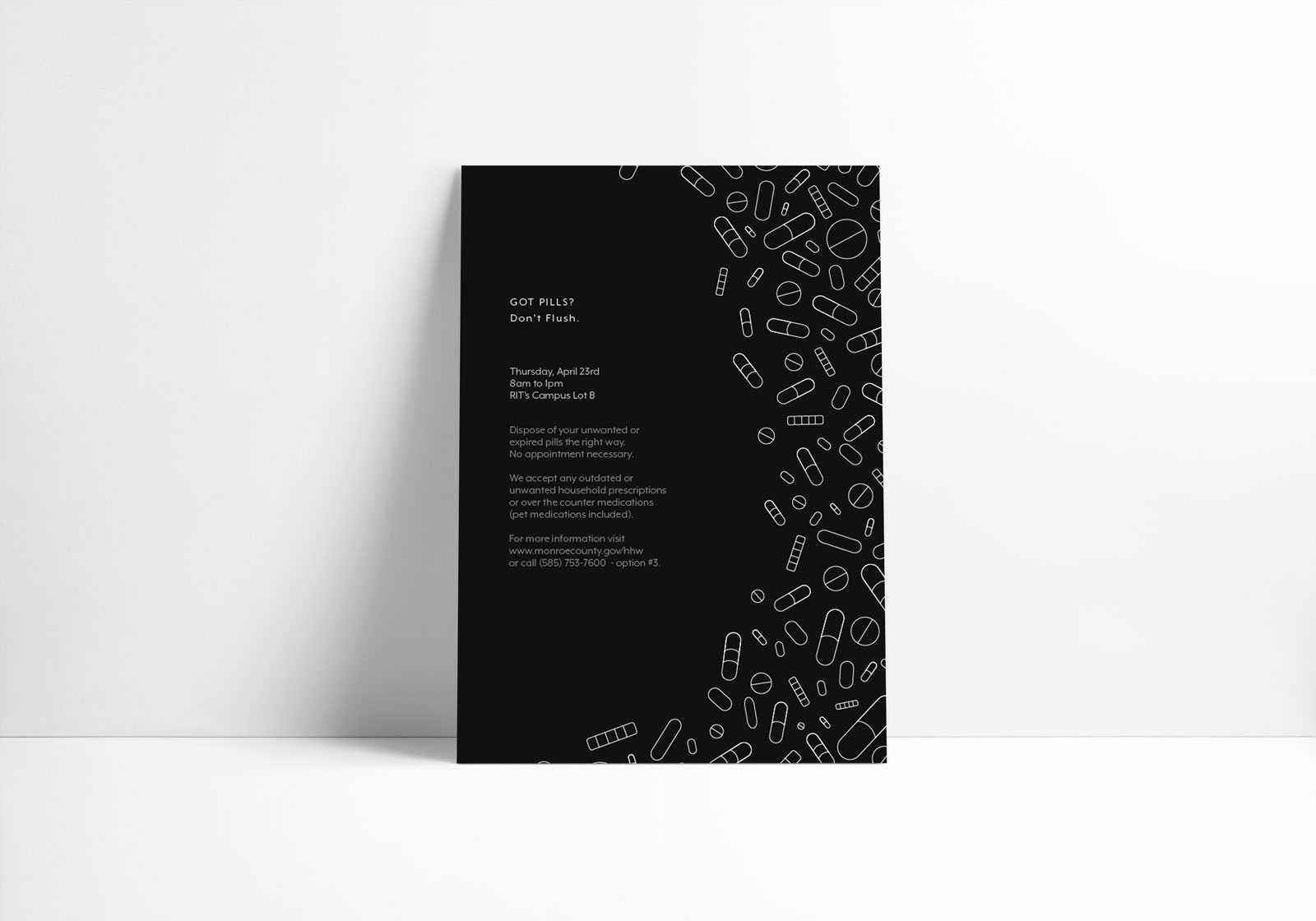
1 SIZE, 1 WEIGHT, 1 TYPEFACE
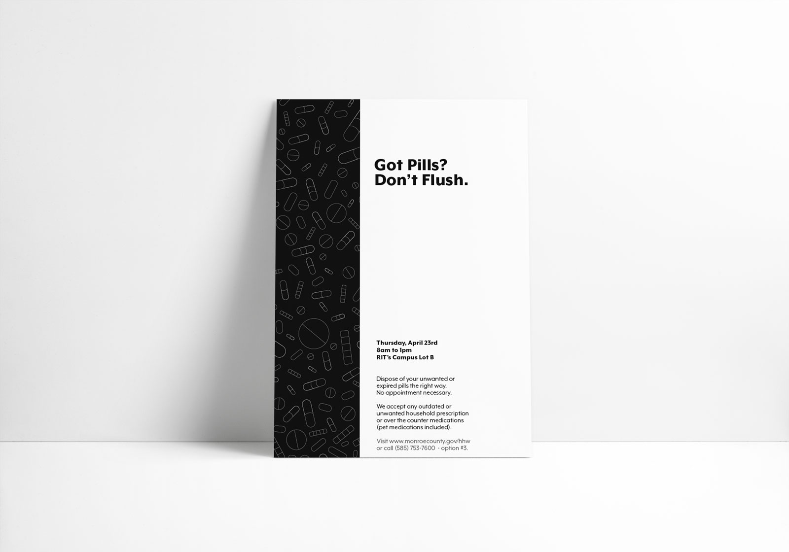
2 SIZES, 2 WEIGHTS, 1 TYPEFACE
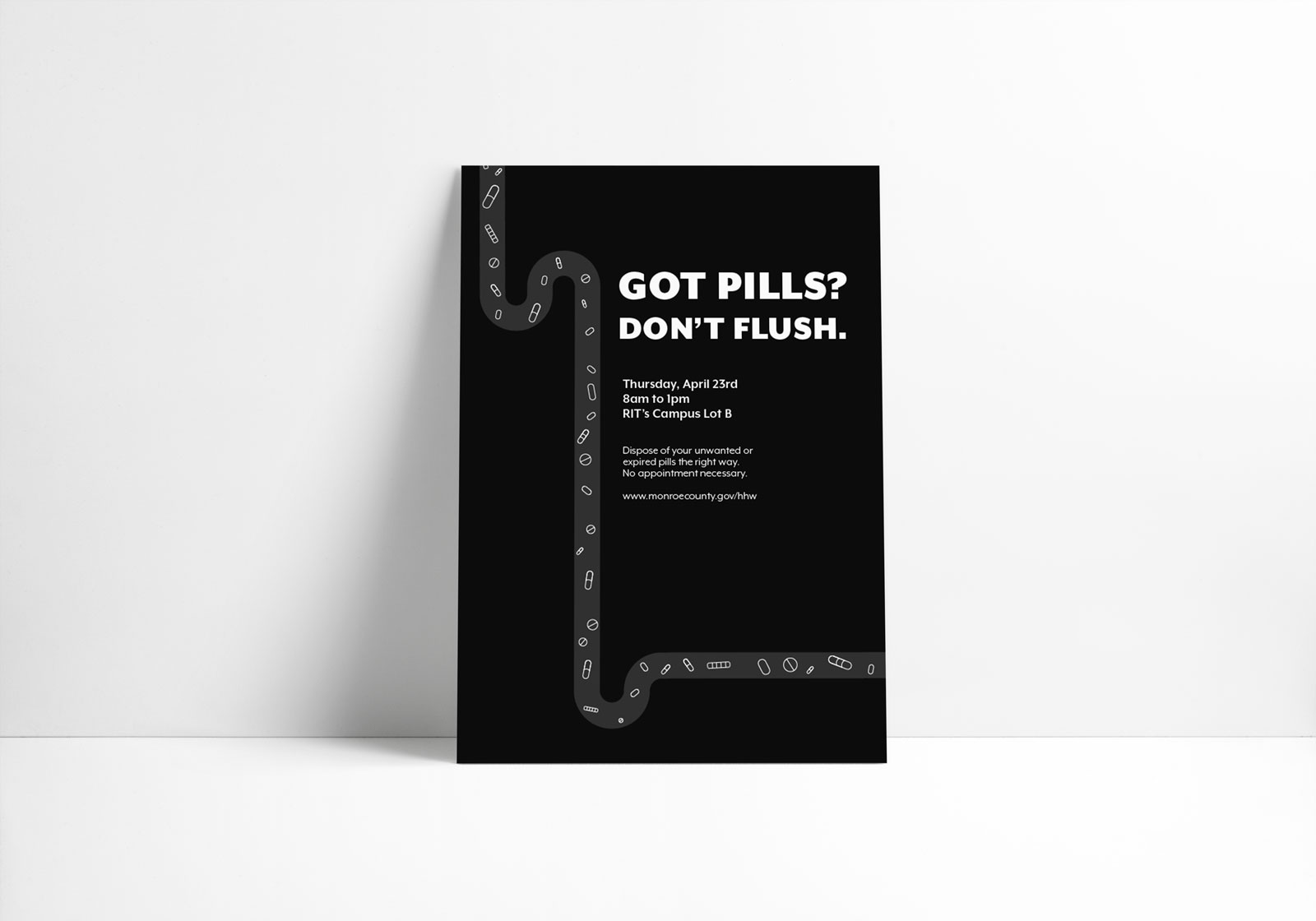
ANY SIZES, ANY WEIGHTS, 1 TYPEFACE
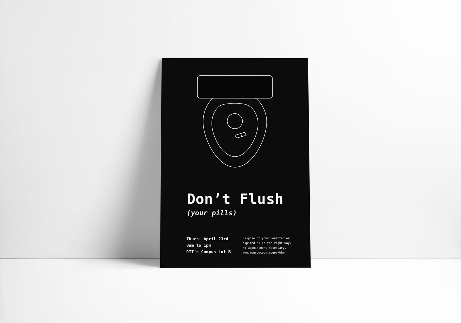
ANY SIZES, ANY WEIGHTS, UP TO 2 TYPEFACES
With so many strict constraints, I was really forced to pay close attention to the typography and learned a lot about type hierarchy and how to prioritize and emphasize the important information. After many iterations and explorations I settled on the four finals above.
The Original Poster