Imperfect Personas: A design thinking exercise
Imperfect Personas helps designers to visualize their users and seeks to educate for better design practices, so our users reflect the actual, real world people who interact with our work, not some idealized stock character.
SKILLS
Leadership, Visual Design, Remote Collaboration, UI/UX, Concepting, Print, Typography
DURATION
Fall 2020 - 16 weeks
TEAM
Liza Comley, Ben Mendelsohn, Emily Irving, Angus Tang, Paul Cullen
Designing better user personas through empathy
Problem
You can’t have user experience without the user.
Users are the most important part of the UI/UX design process, but often times when we create example users and personas, they’re flawed... by being too perfect.
Solution
A card based exercise and accompanying user guide that encourages designers to better understand and empathize with their imperfect users, which translates to a digital, interactive version of the experience.
Project Goals
Ethical Education
Inform designers on why user personas matter, and what they can do to construct better ones.
Empathy, Empathy, Empathy
Emphasize the importance of empathizing with the user personas designers create.
A Flexible Product
Create an exercise that can be used in different ways throughout the design process.
Make it Interactive
Allow designers everywhere to access the exercise through an online, interactive version.
Concept
This project was inspired by a few different sources.
We were heavily inspired by card games and interactive toys,
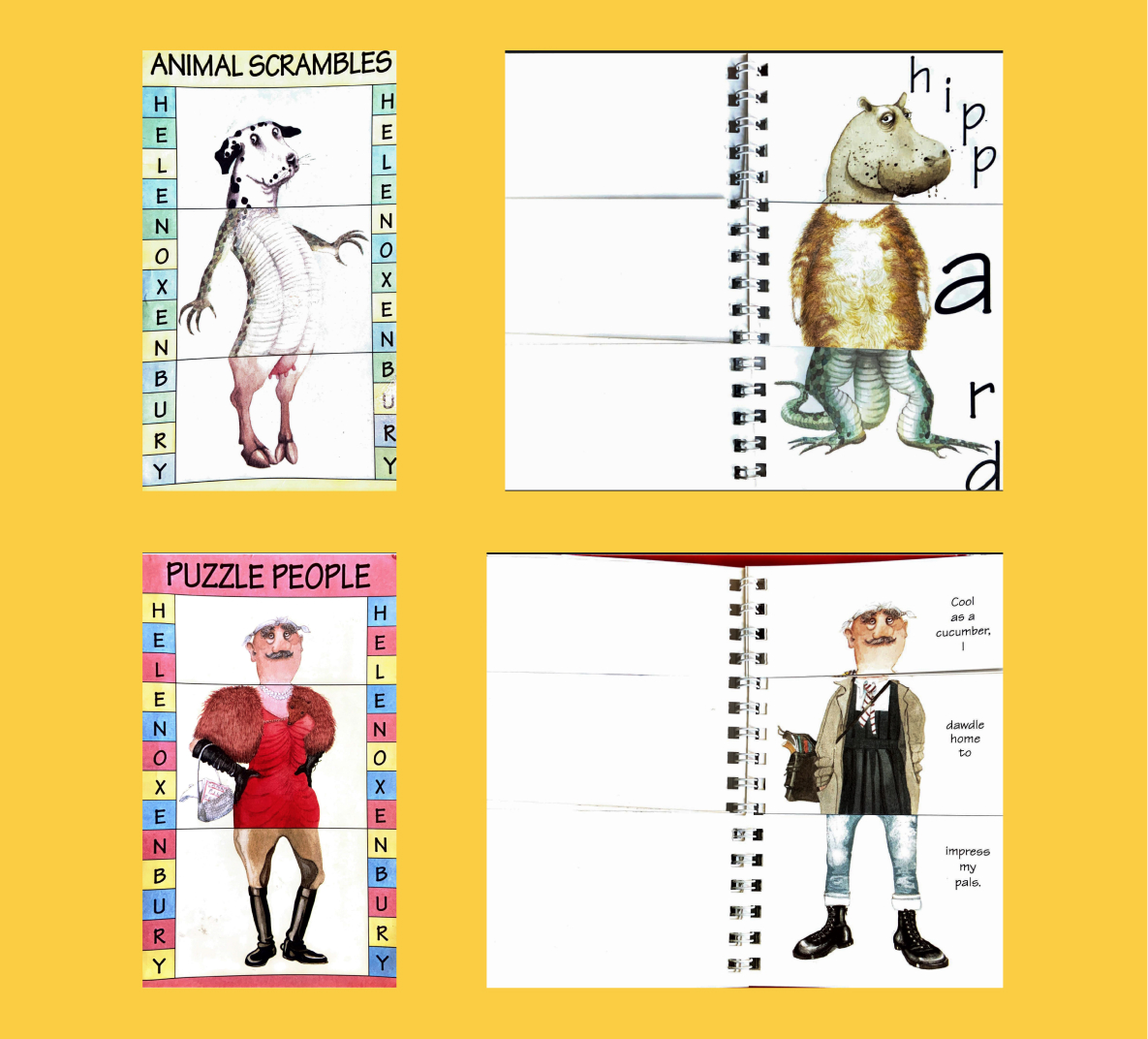
Animal Scrambles & Puzzle People Books
Toys from my childhood
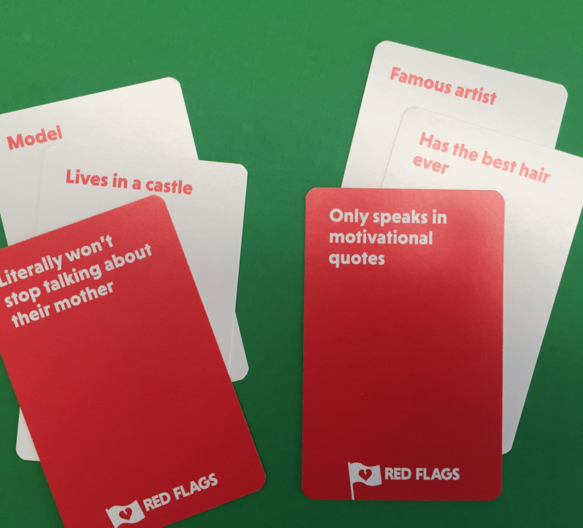
Game of Red Flags
Card Game
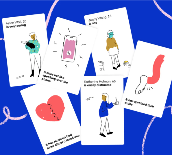
Cards for Humanity
Design Exercise by Idean
The definition of an imperfect persona is based off of an excerpt from the book "Design for Real Life" by Eric Meyer & Sara Wachter-Boettcher, where they define what an imperfect persona is and why it is crucial to consider.
Based on that, we came up with 5 different elements that make up an imperfect user persona, and each member of the group designed the experience for one element. Identity was mine.
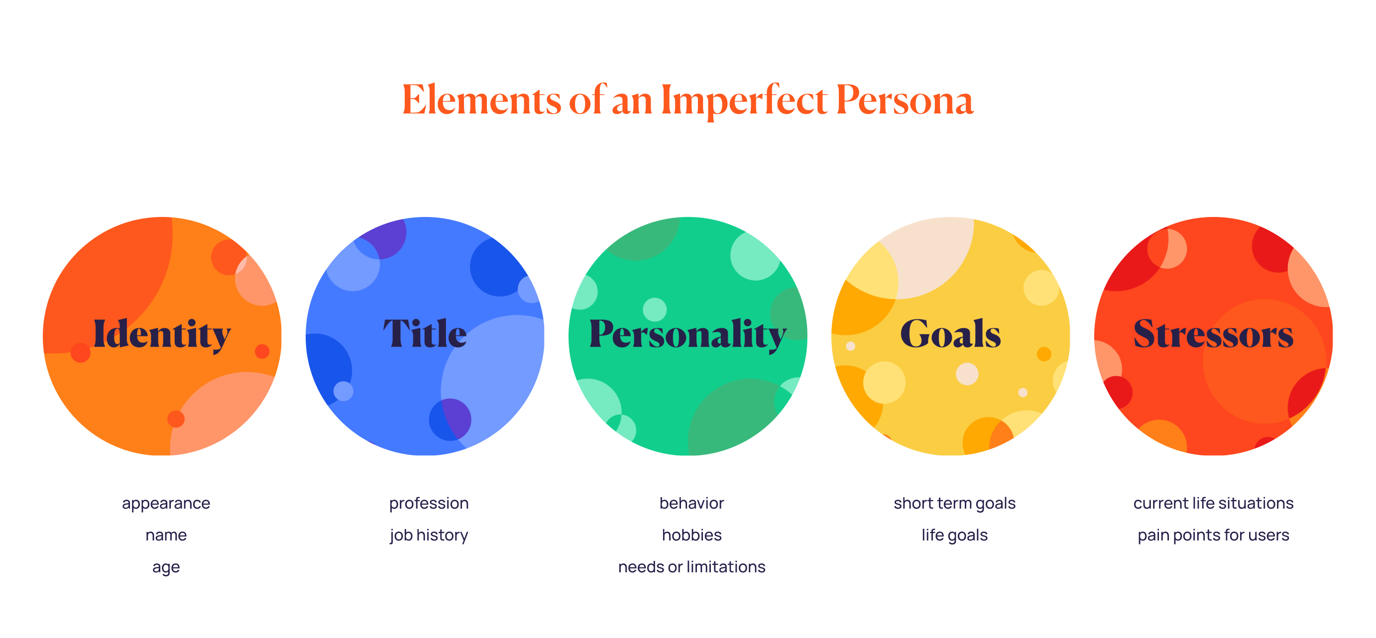
Physical Experience
The physical version of Imperfect Personas includes:
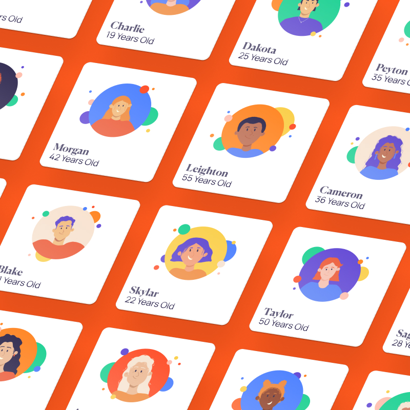
5 decks of cards (24 cards in every deck) that each embody one element of an imperfect persona.
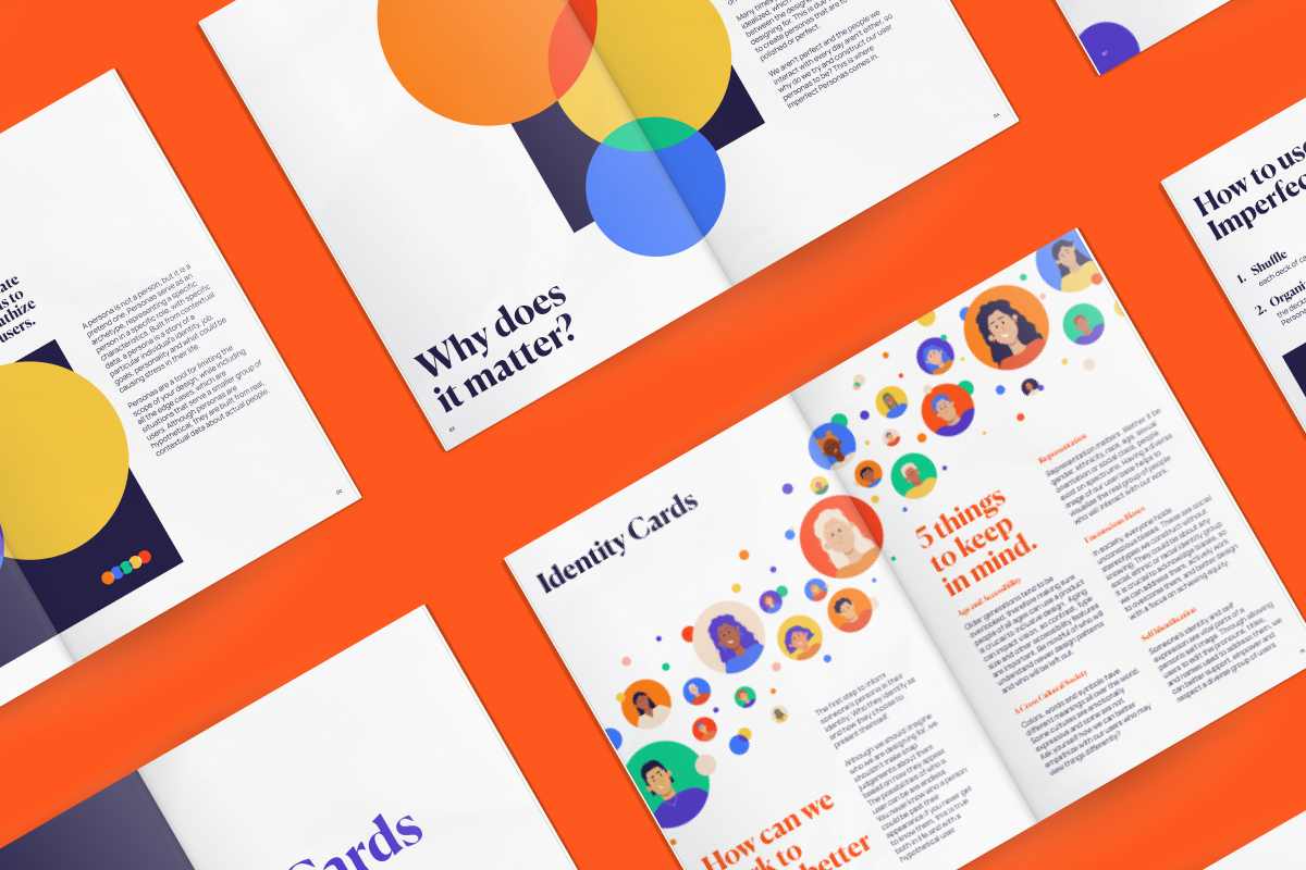
A user guide that explains why personas matter, how to better design for users, and of course, how to use the cards.
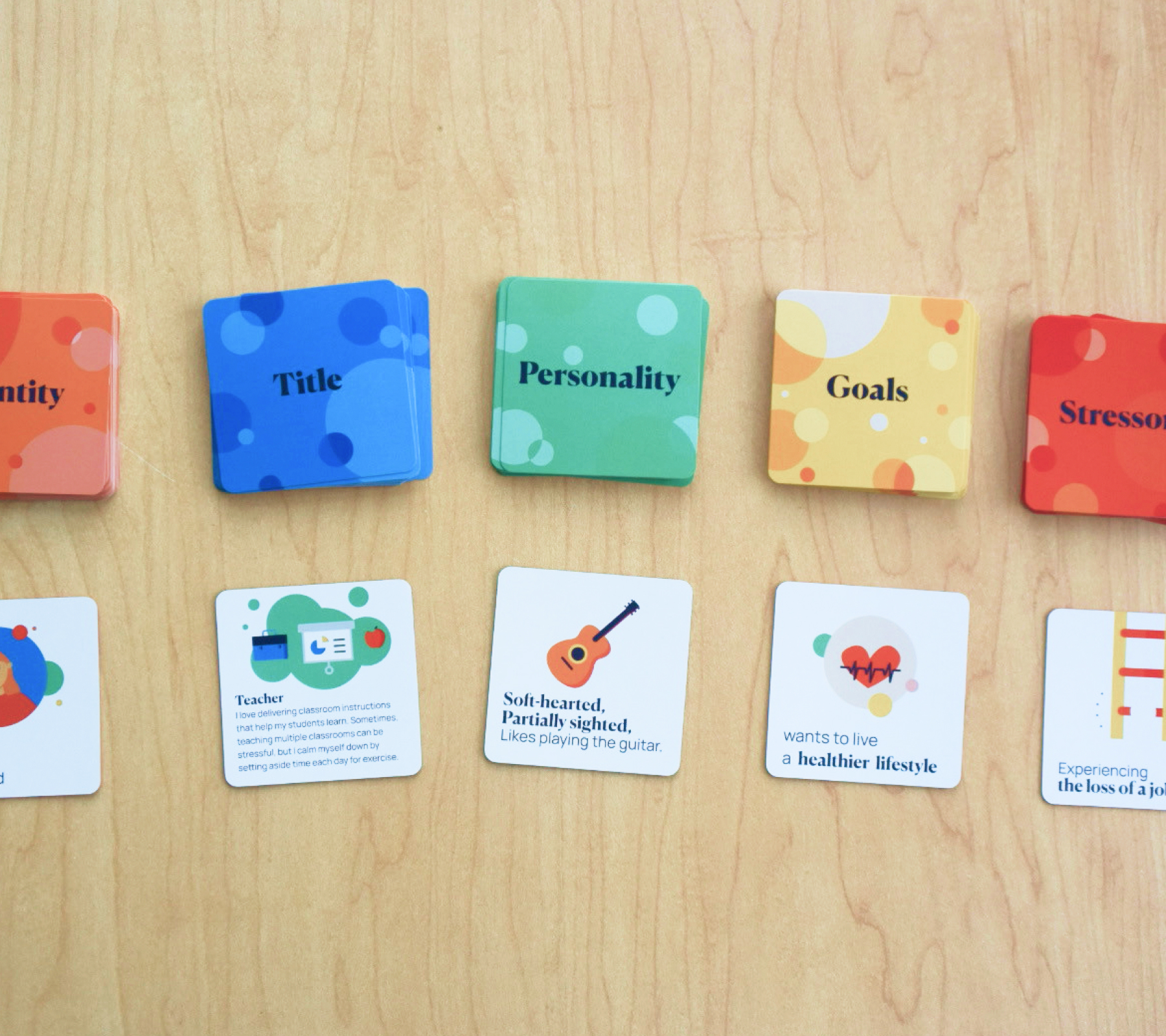
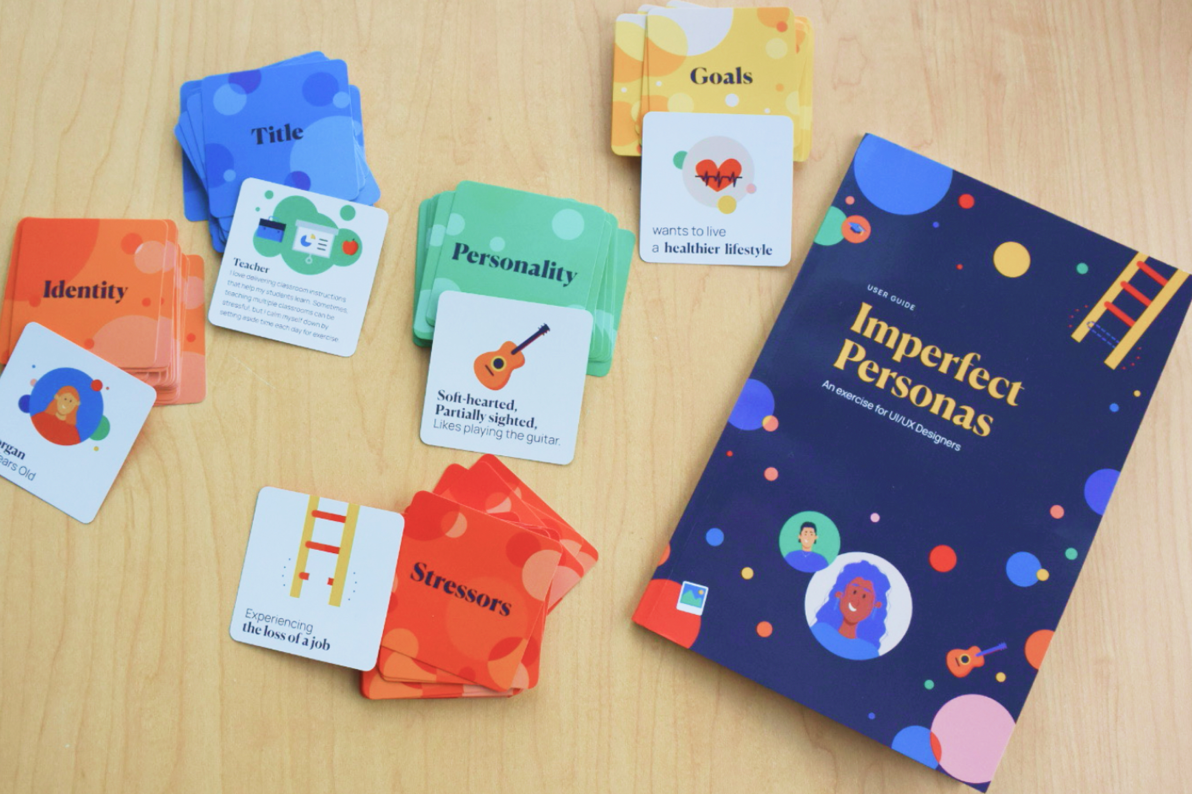
Final Print Content
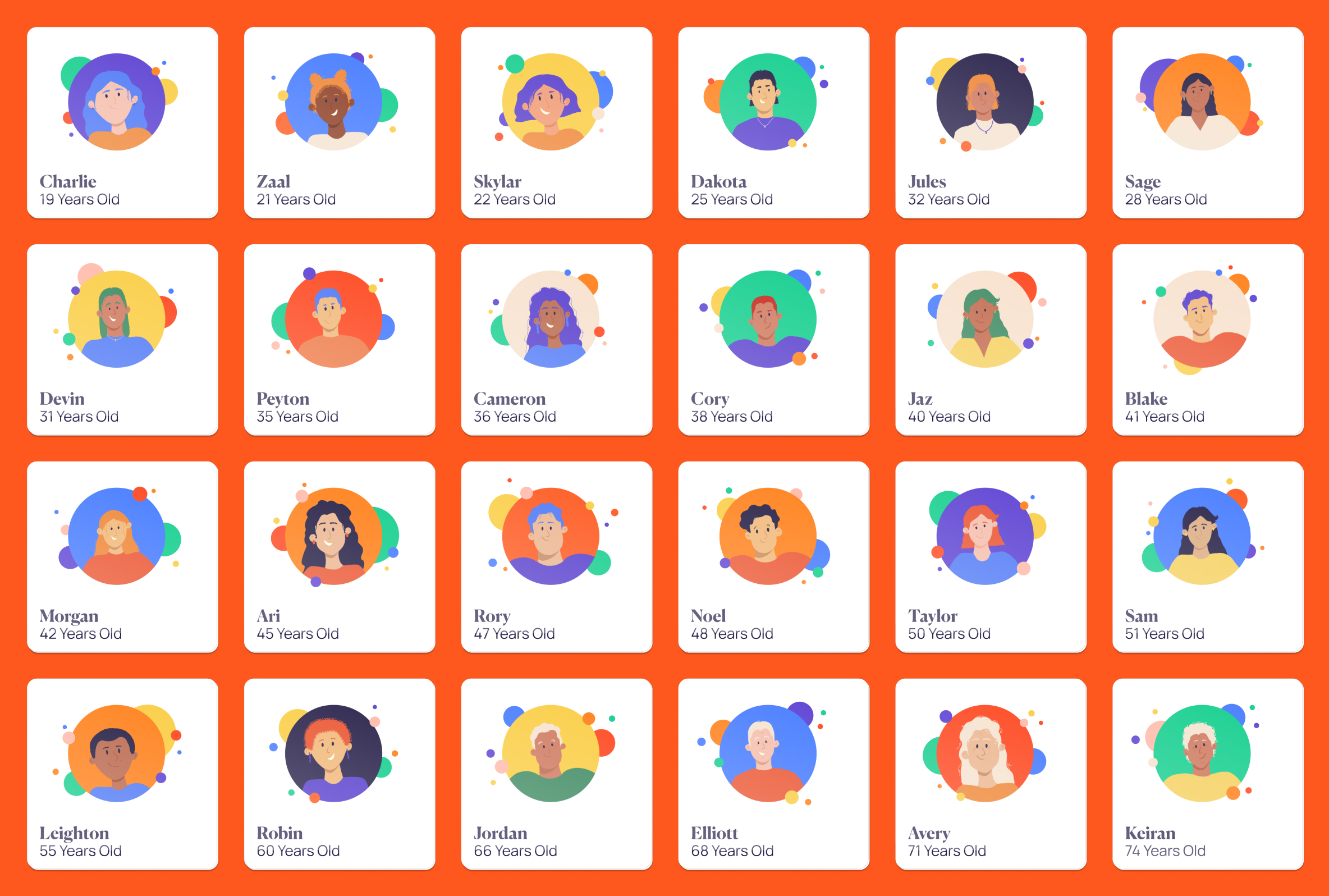
Identity Cards
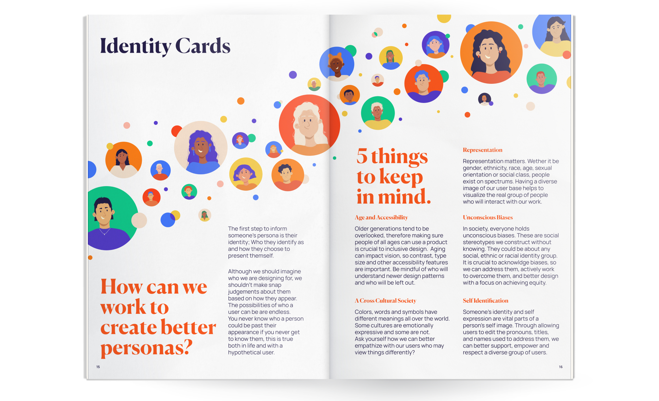
Identity Spread
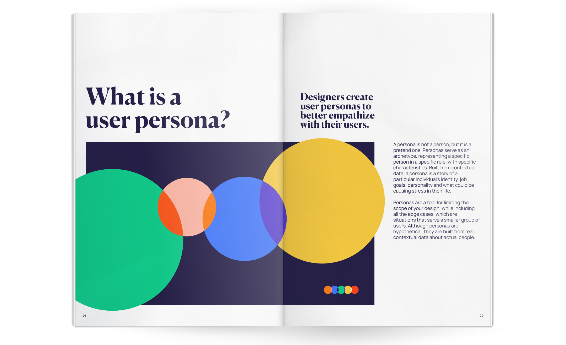
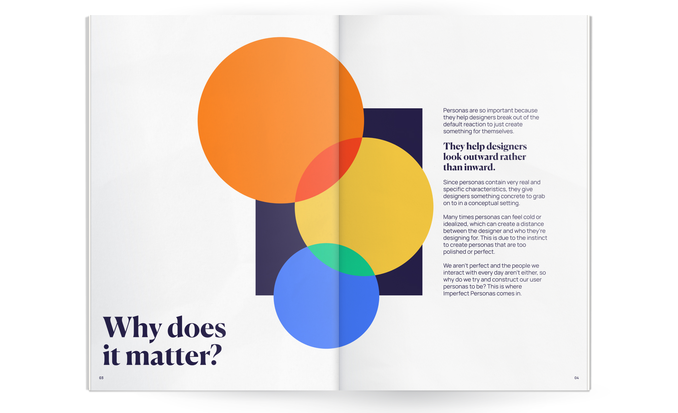
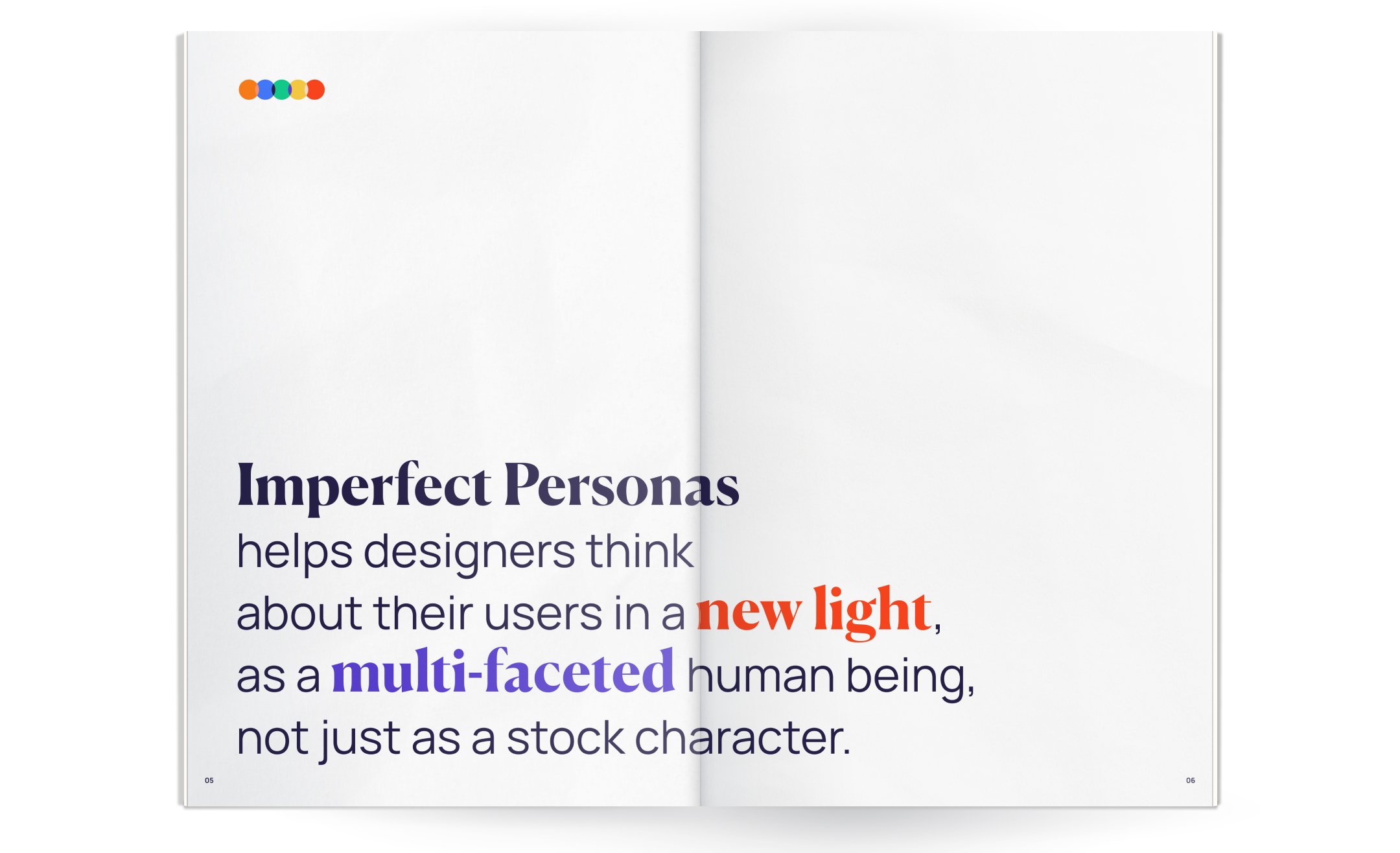
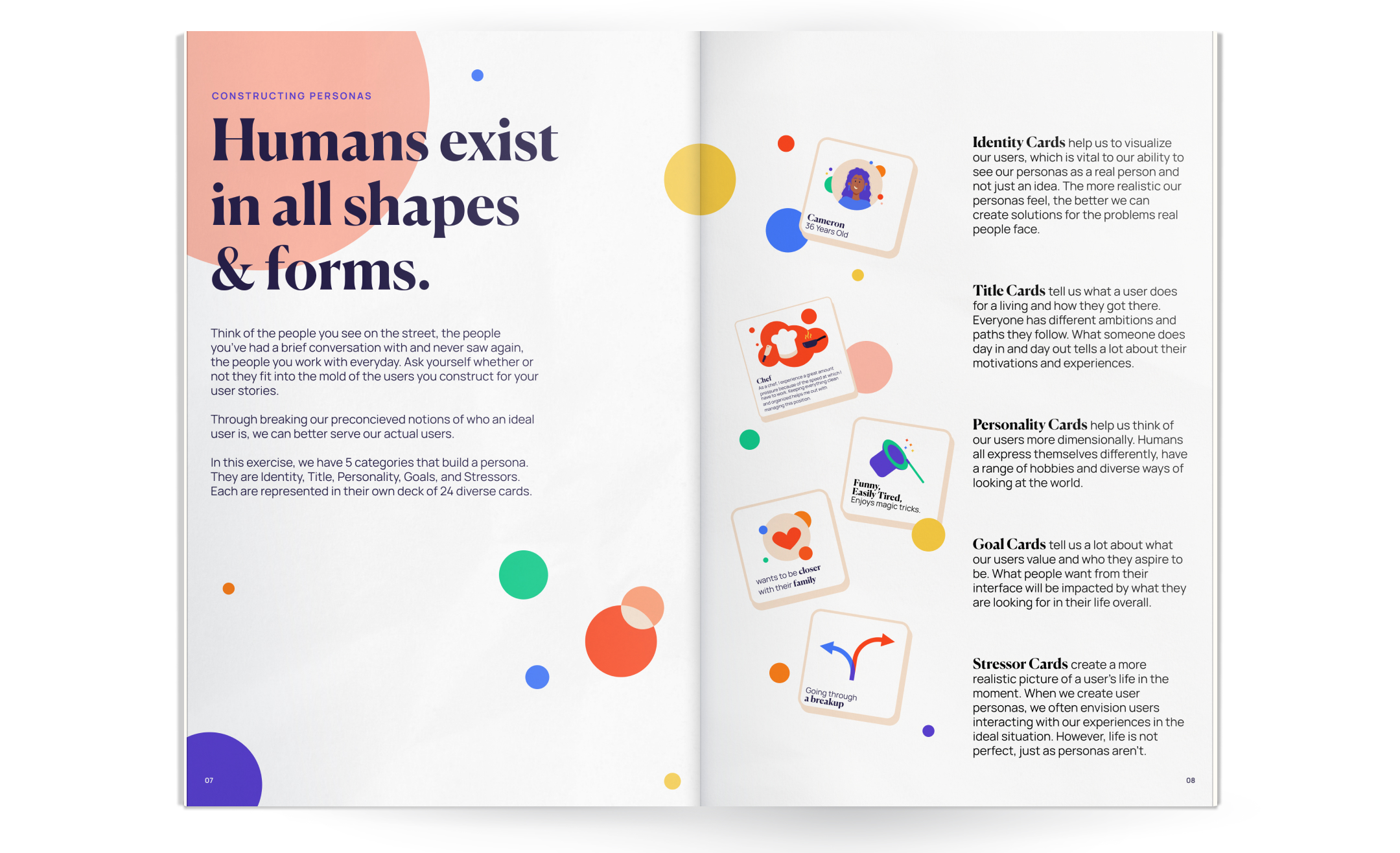
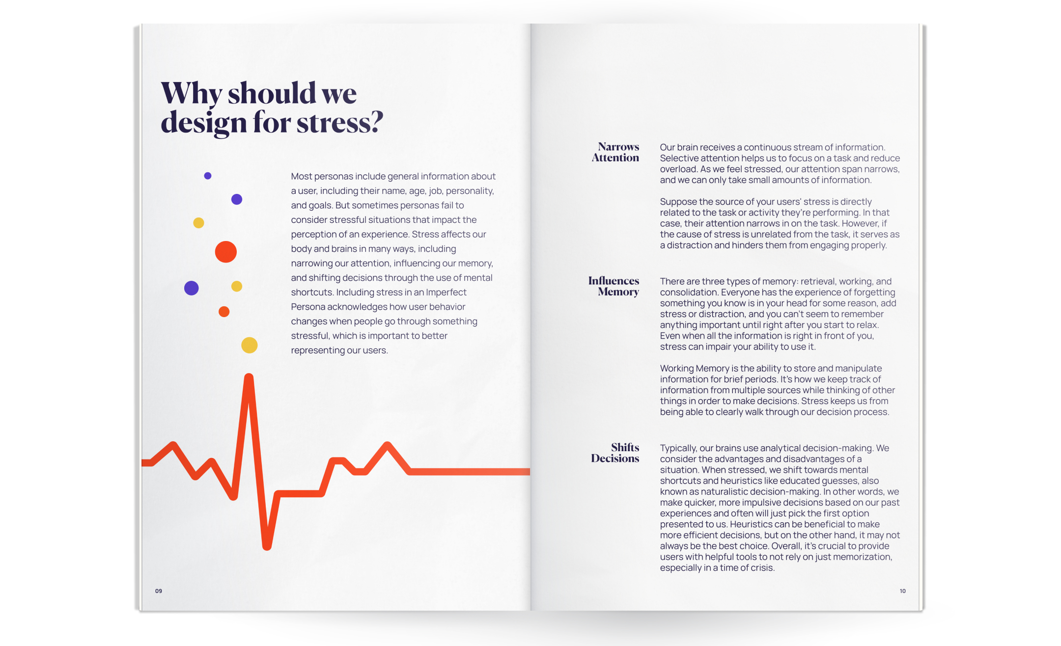
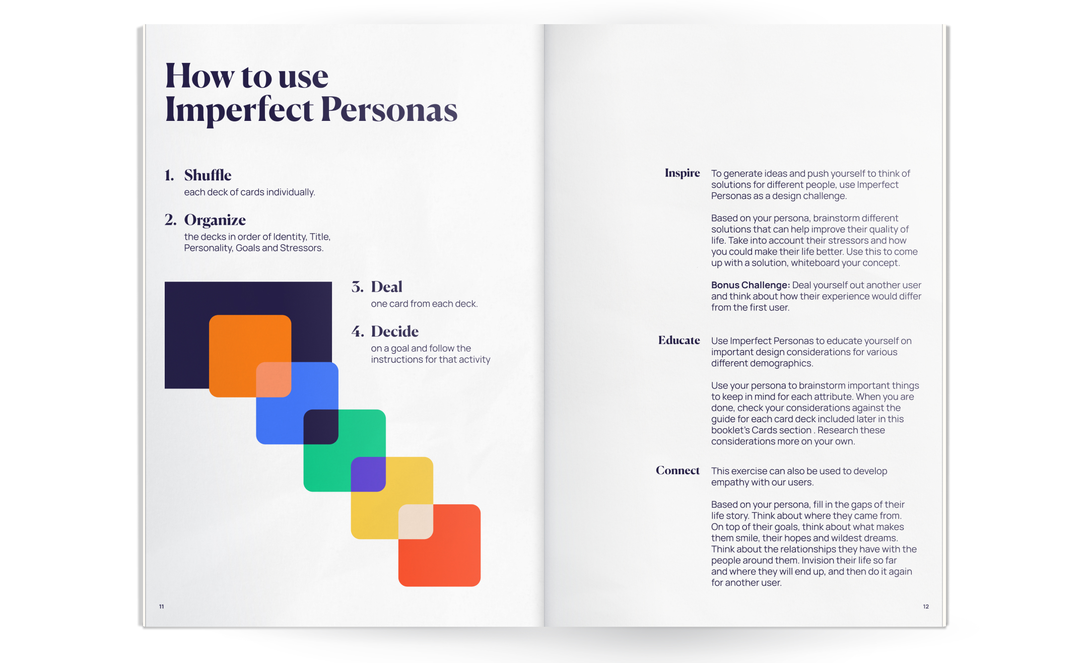
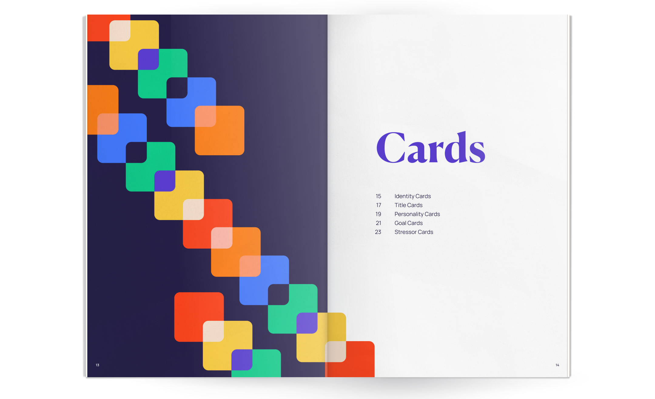

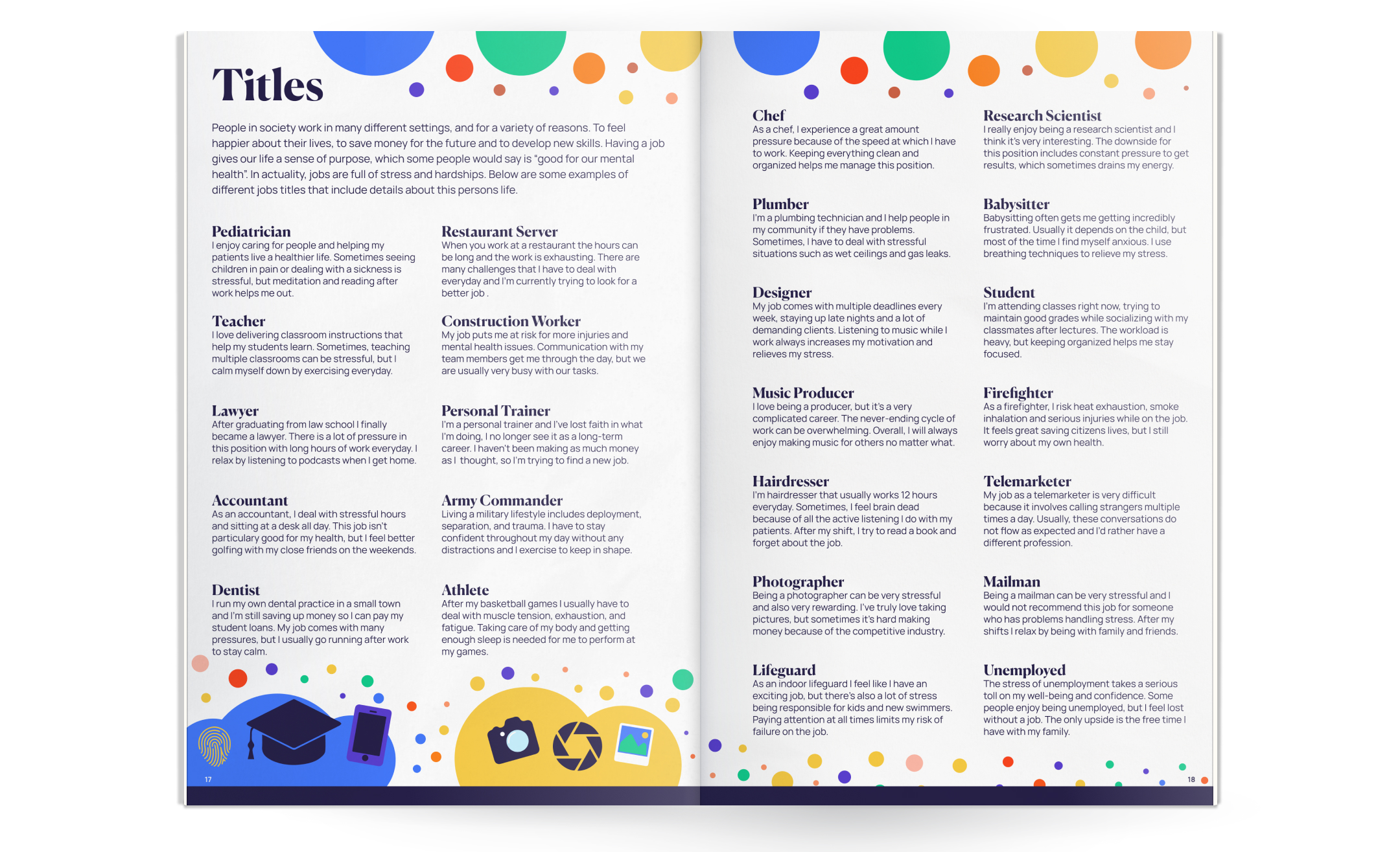
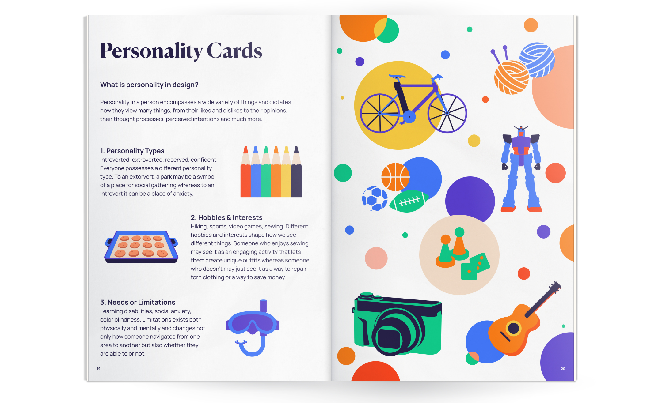
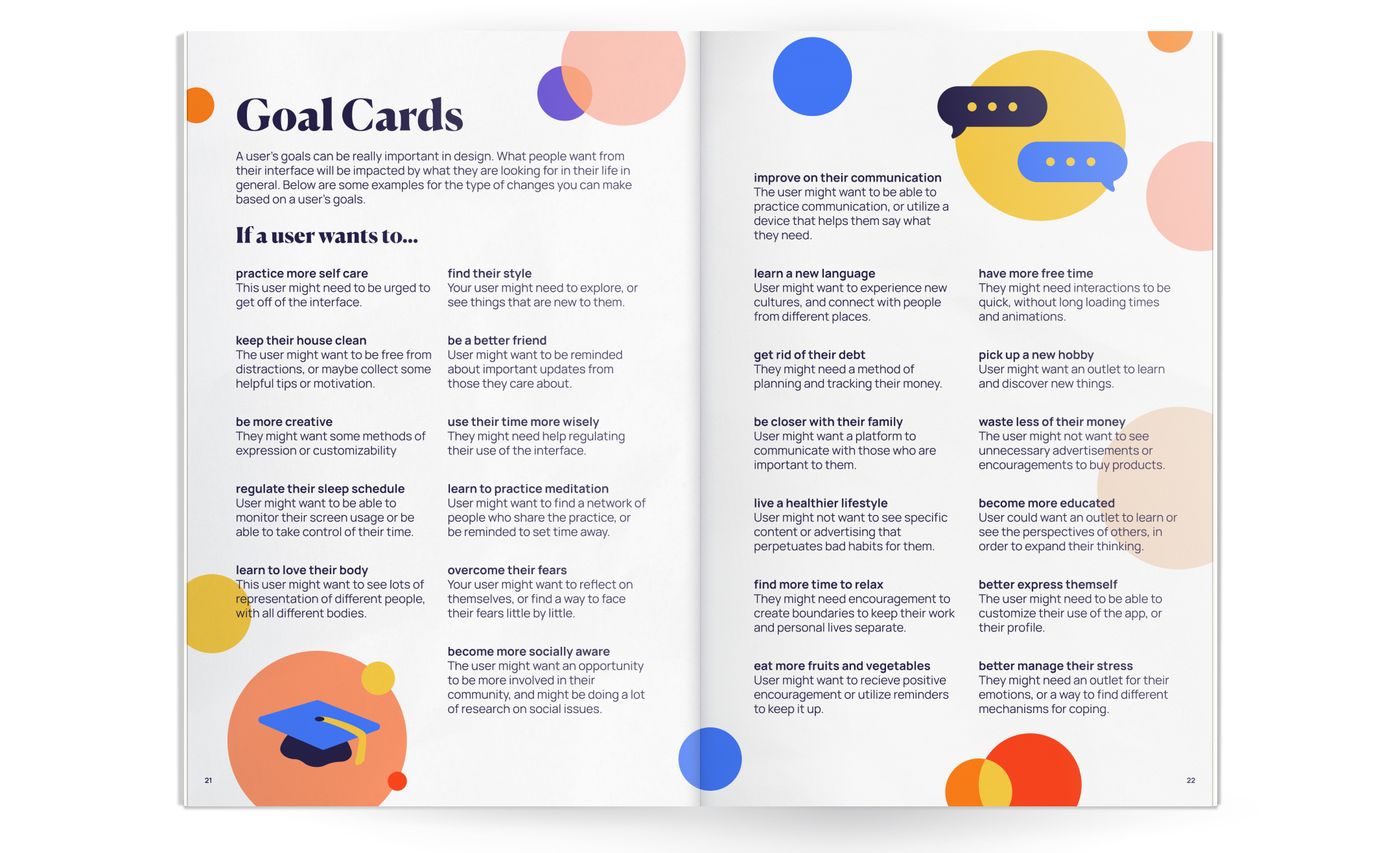
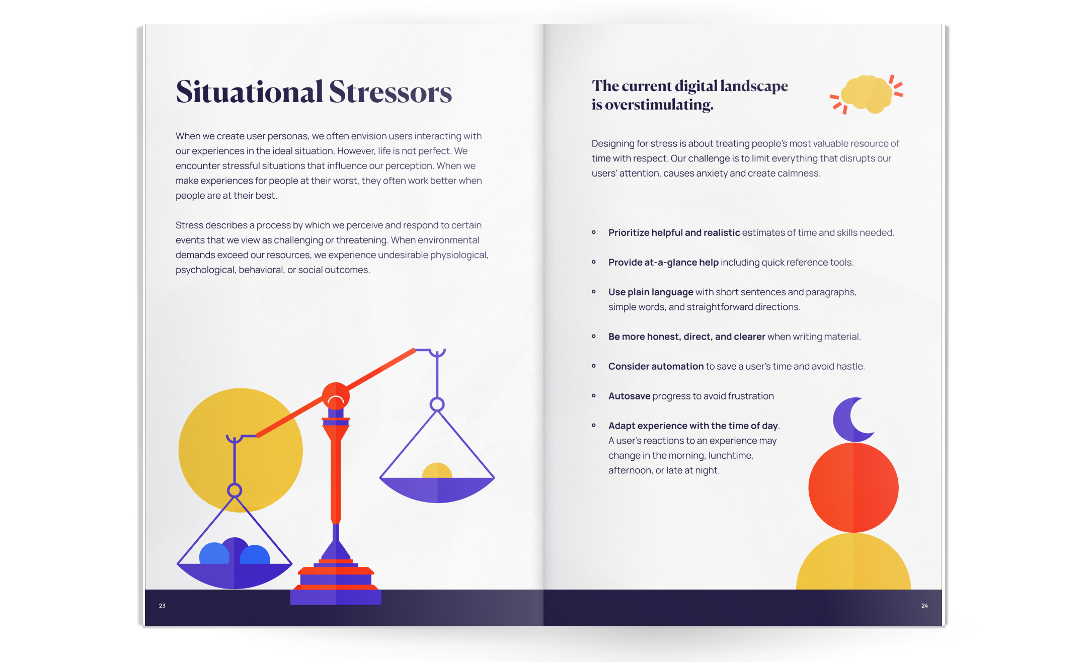
Full Book
worked on all pages except for titles, personality, goals and stressors spreads
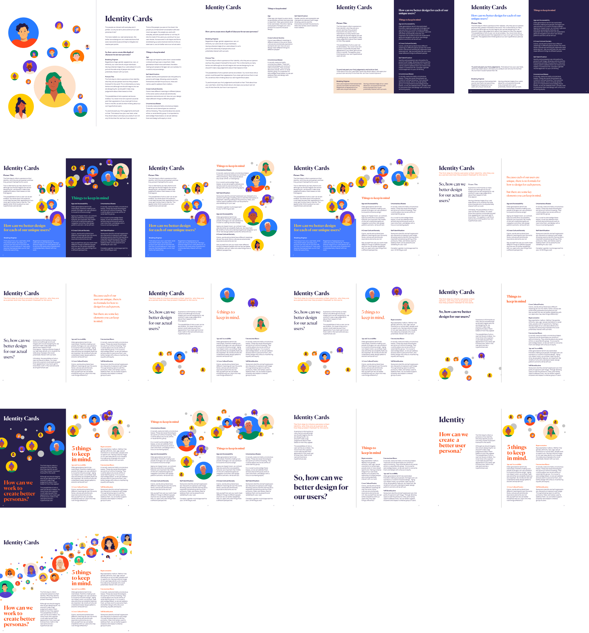
Identity Spread Iteration
Interactive Experience
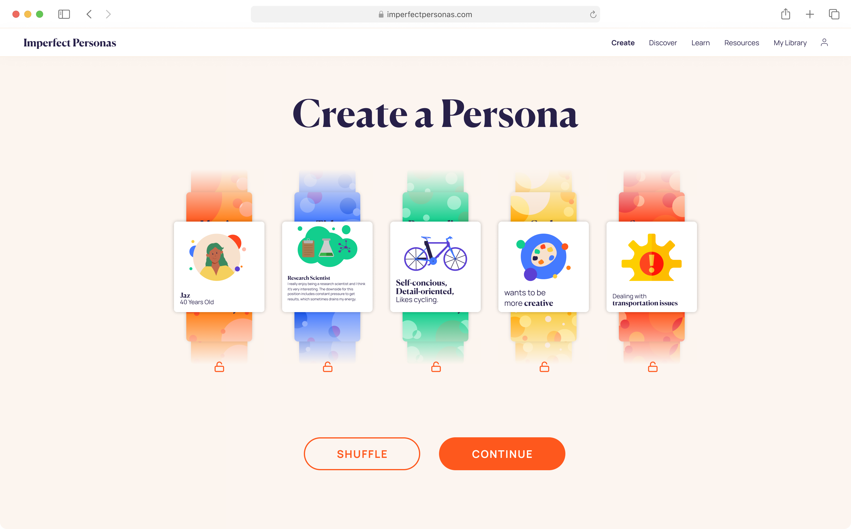
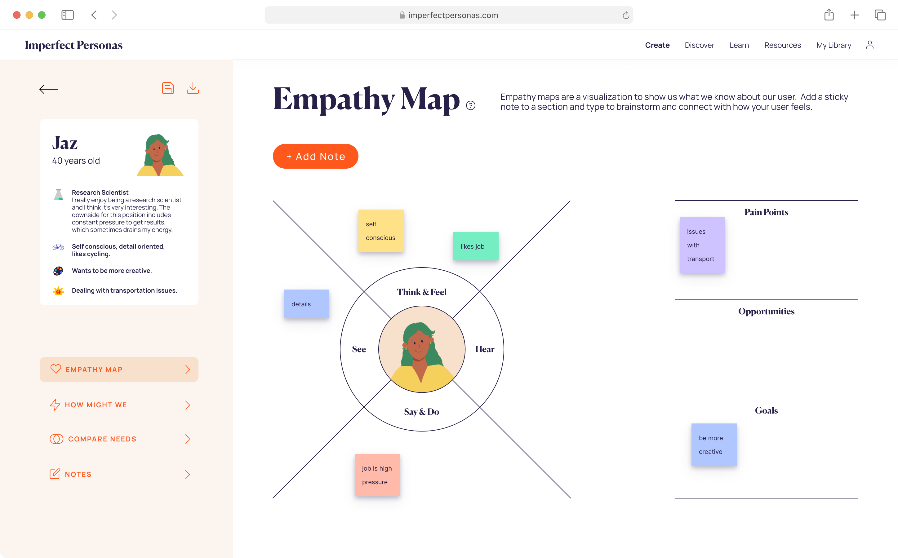
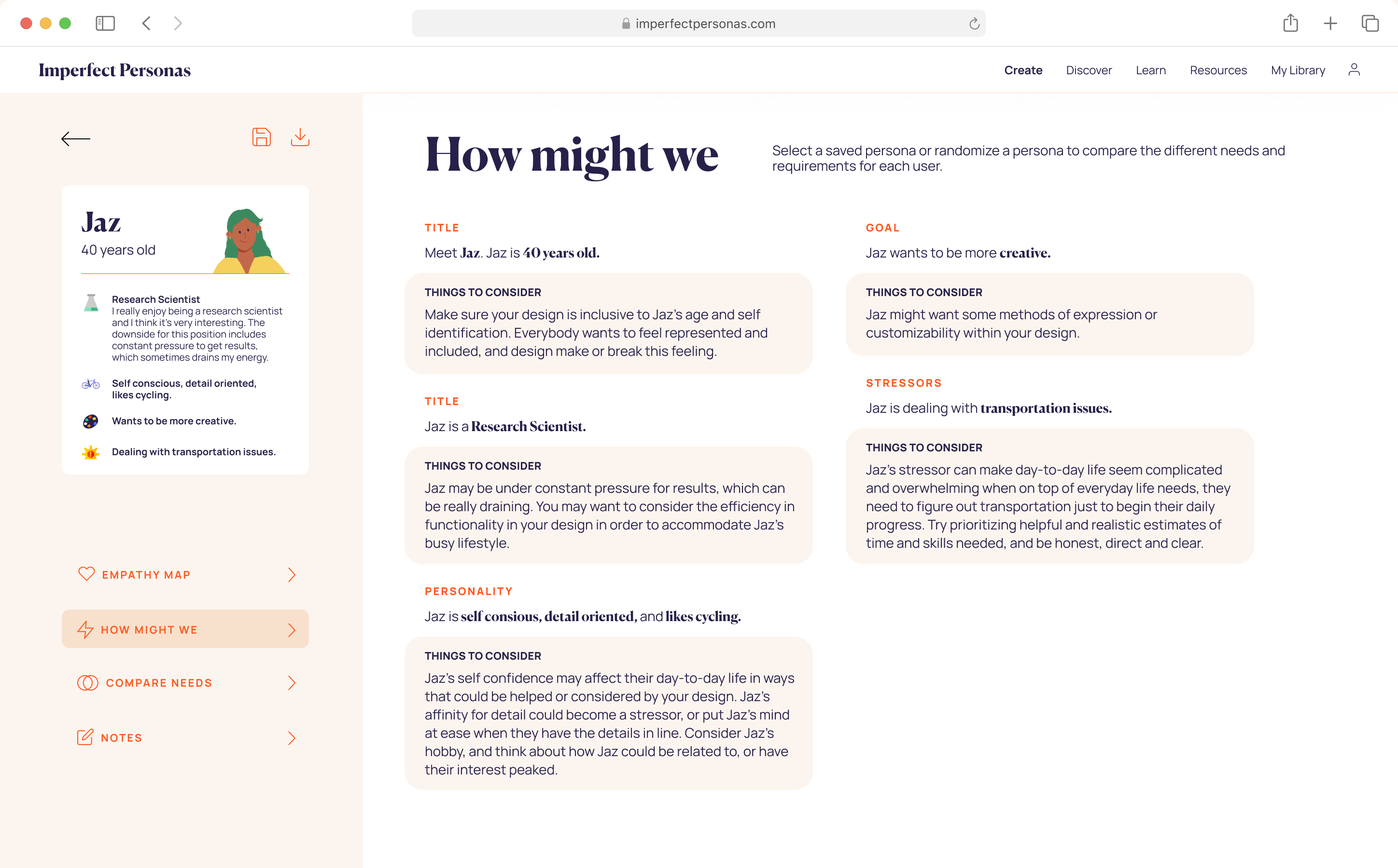
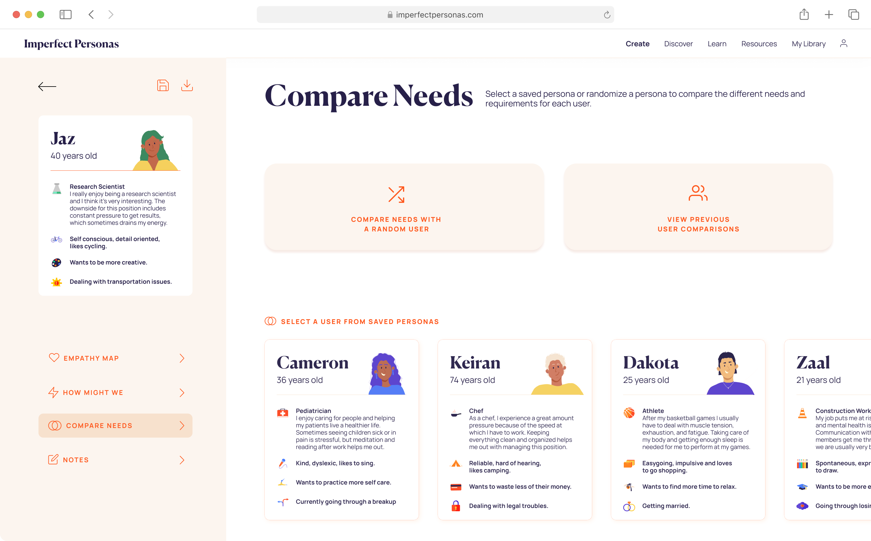
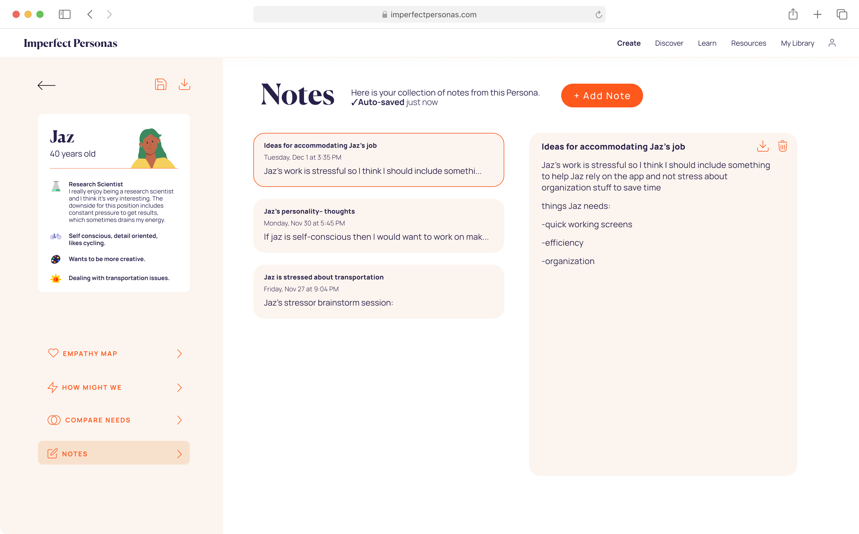
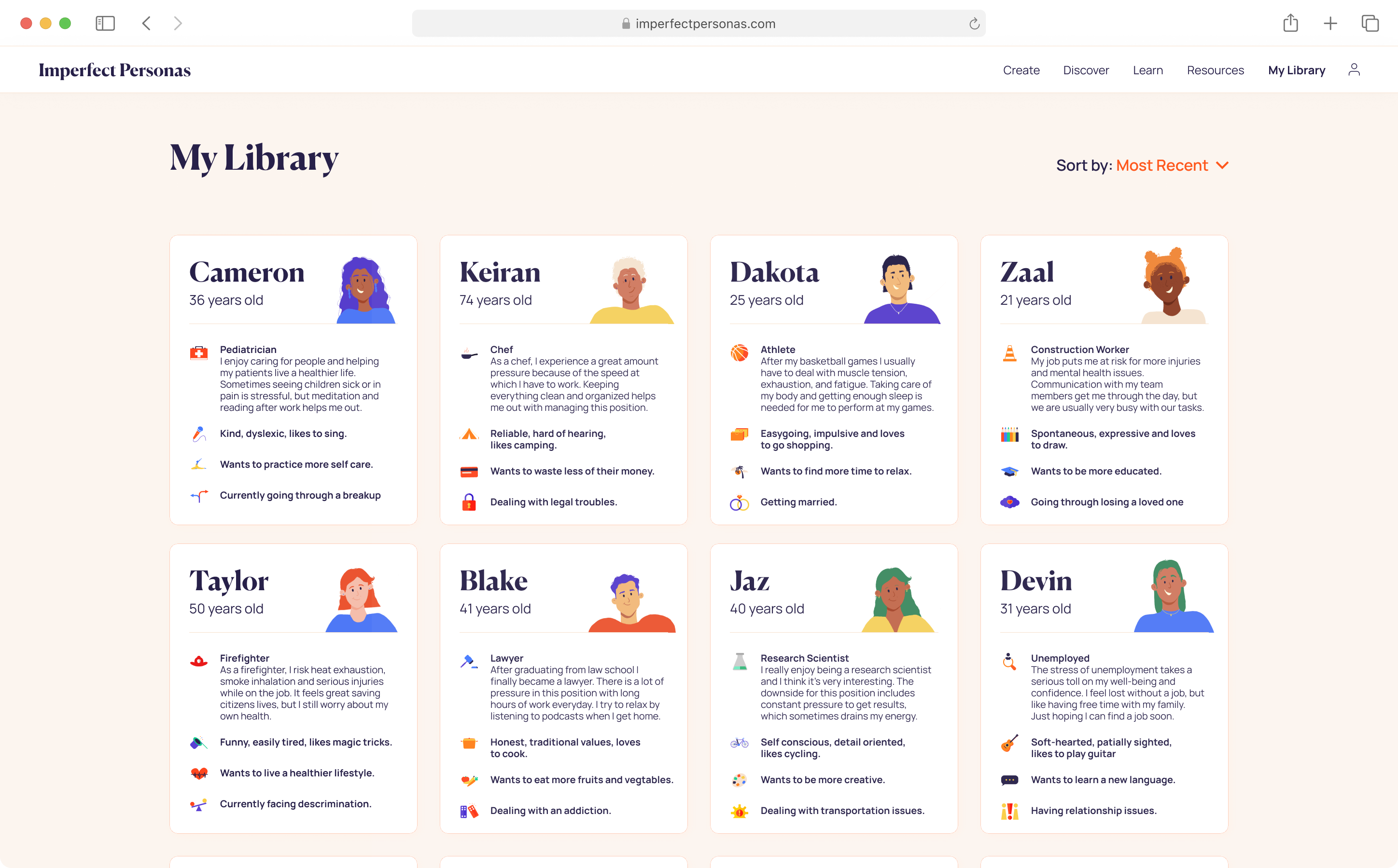
The interactive experience of Imperfect Personas strives to elaborate on the physical experience while translating it into a web based medium.
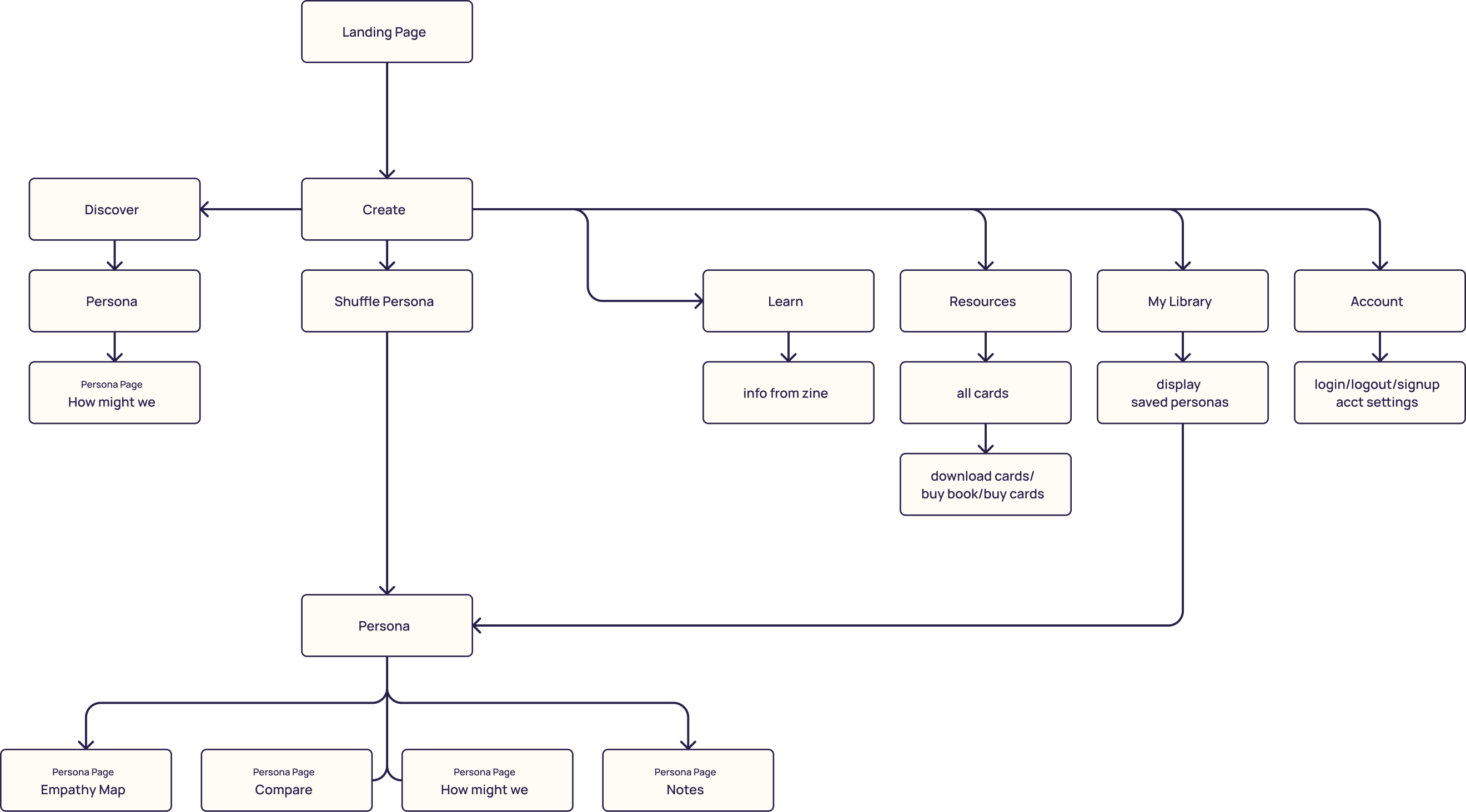
We created this information architecture to understand the depth of the site and the navigation we need.
Final Interaction Screens
Visual Style
Something that was challenging with 5 group members who were not in direct contact with eachother was maintaining a consistent visual style. We accomplished this by setting strict guidelines for grids, type and color usage.
We utilized an 8-point baseline grid throughout the project and had a distinctive style guide that we followed.
We established templates for each aspect of the project in order to make sure all visual elements matched eachother.

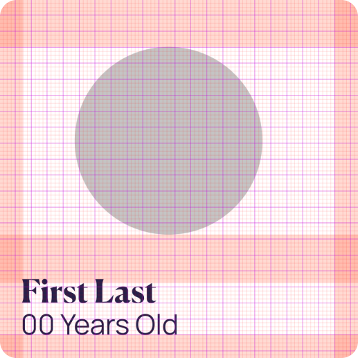
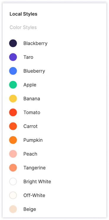
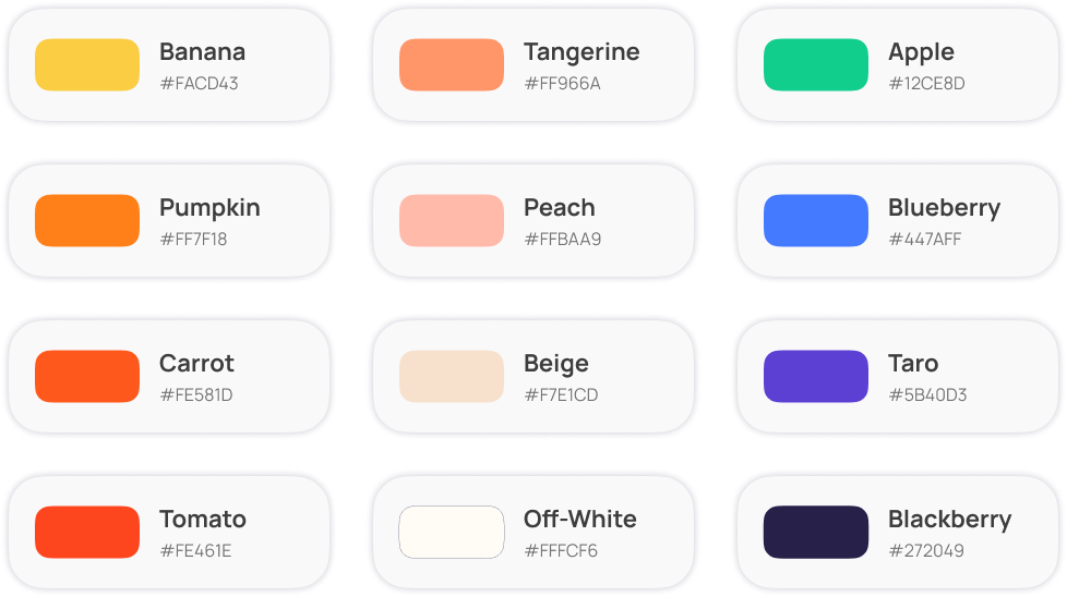
grid, template & color styles
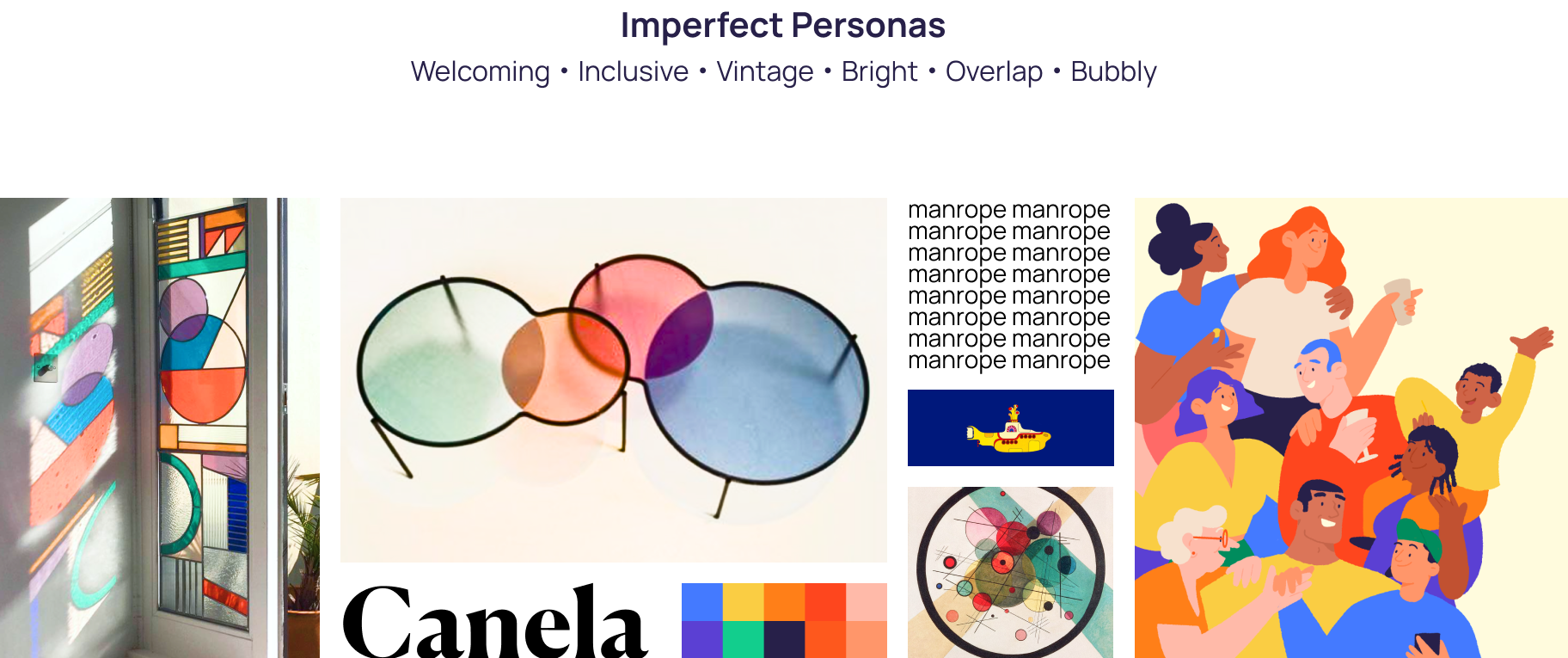
overall mood/style board
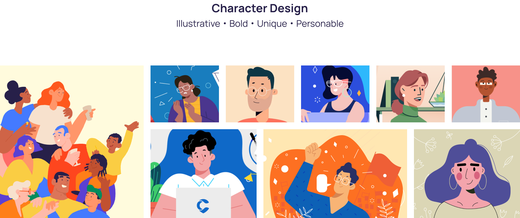
character illustration style board

final character illustrations, created in procreate
Reflection
This project was a difficult one because of the circumstances, but despite working remotely in a group during a global pandemic we managed to transform many of our challenges into opportunities.
One of our group members, Angus, was not only remote but he was in Hong Kong, so working out a weekly meeting time outside of our classes and communicating clearly was crucial. Many times, another group member, Ben, and I would sit on a zoom call and just do work together and that made things feel a lot more normal.
We did the majority of our work in Figma, which was an absolute savior for this project. It enabled us to work on our own and remotely but still be interacting with eachother and able to use assets and components from the library we created.
Overall, I learned so much about working in a team from this project, from how to more effectively communicate and organize tasks to how to keep a consistent style between 5 people who have not seen eachother in person for months. It has been a great, although stressful, experience and has led to one of my favorite projects.
The User Guide is available for purchase here and cards are available for purchase here. And as far as the interactive experience, I am planning on eventually developing it into a free, live website for designers everywhere to use.