Digital ID Application
DURATION
4 Weeks, Spring 2020
SKILLS
Product Design, UX/UI Design, User Research
What if your ID card wasn't a card at all?
Carrying a physical ID will be a thing of the past.
Everything is moving to mobile these days and that includes your ID card. That's a strange transition for some users who may not have full faith in technology or just are resistant to the change overall.
So how can we create a reliable way to show ID that streamlines the process?
Solution
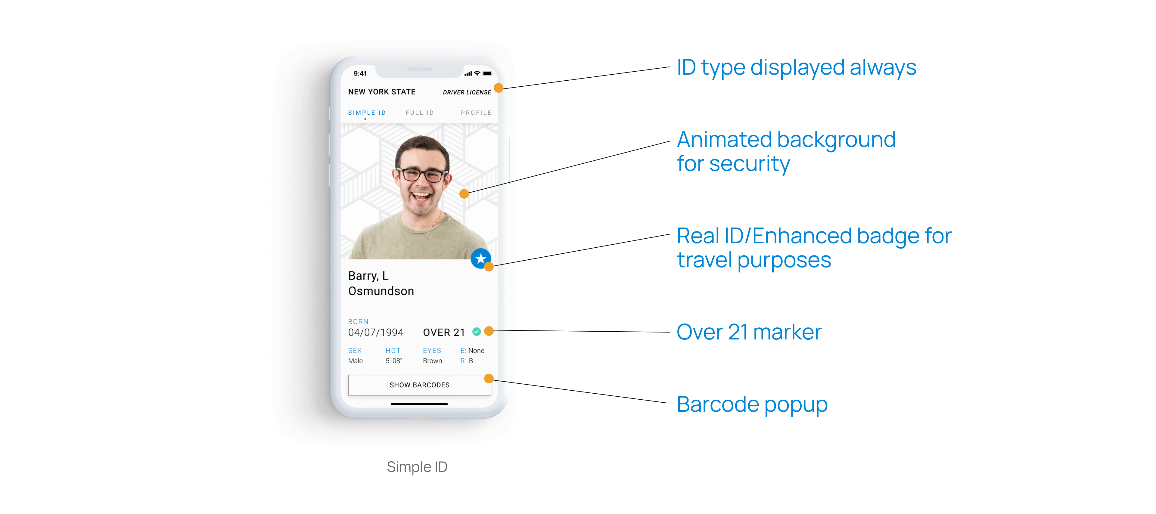
A digital ID application that puts intuition first, prioritizes the user, and keeps in mind accessibility in order to create a seamless experience that leaves the user feeling safe using the new technology.
Use Cases
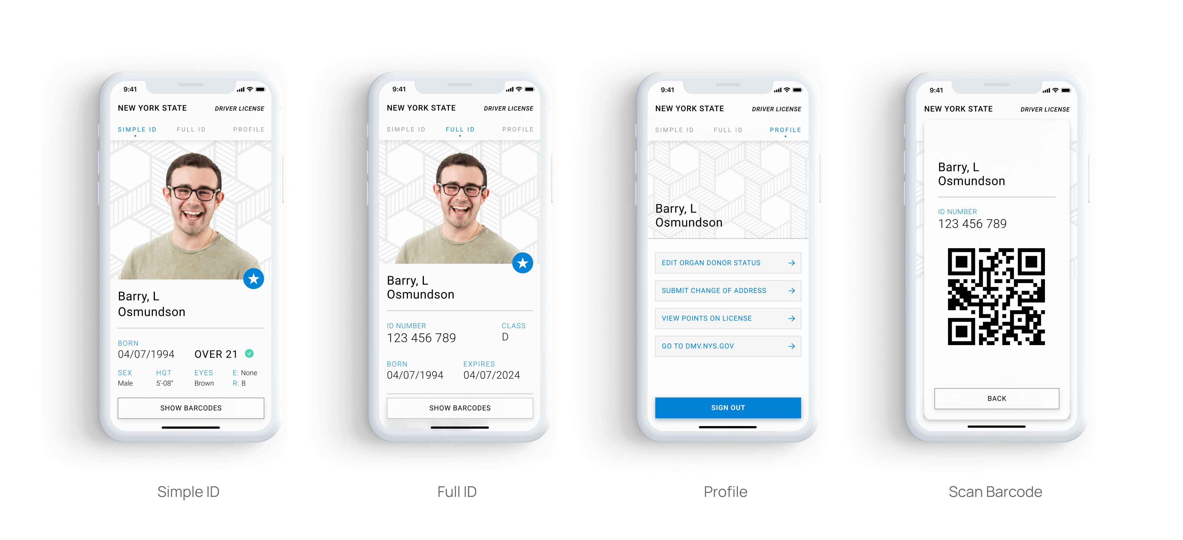
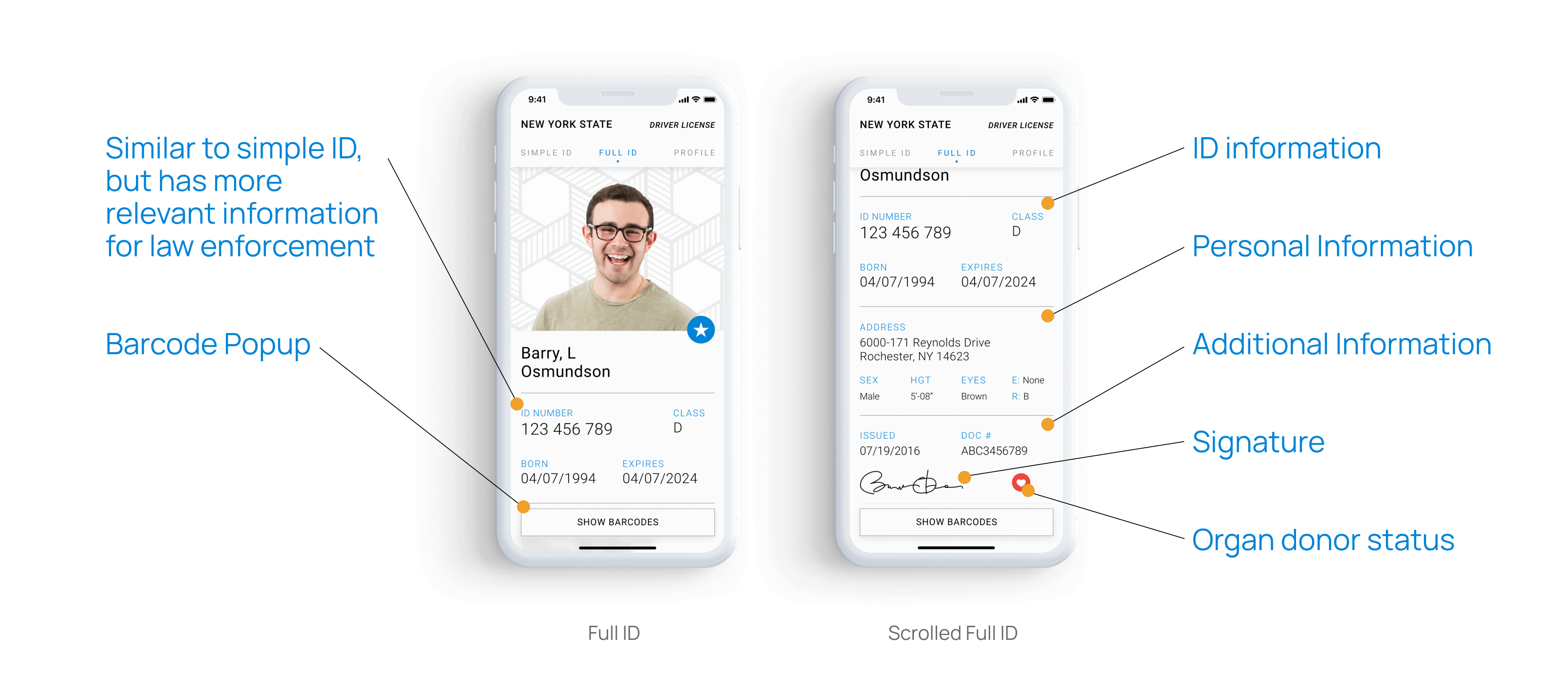
An ID is needed in very specific situations. Many times a user will only need it for a few seconds, rarely is an ID used to do much more that verify your identity quickly in day-to-day life. I created two different versions of the ID to speed up the process of showing ID in everyday situations, where the user may not need all their information displayed.
Simple ID View
Use to verify age for purchases of alcohol, and other age restricted items, purchase restricted medications or just verify identity in general for uses such as travel.
Full ID View
Used in all other situations, such as in an case of emergency, for law enforcement purposes and to reference document and other identity related information that the user needs.
Goals
Intuitive Gestures
Simplify the process of using and showing ID by prioritizing information needed and creating simple gestural transitions between states.
Safety First
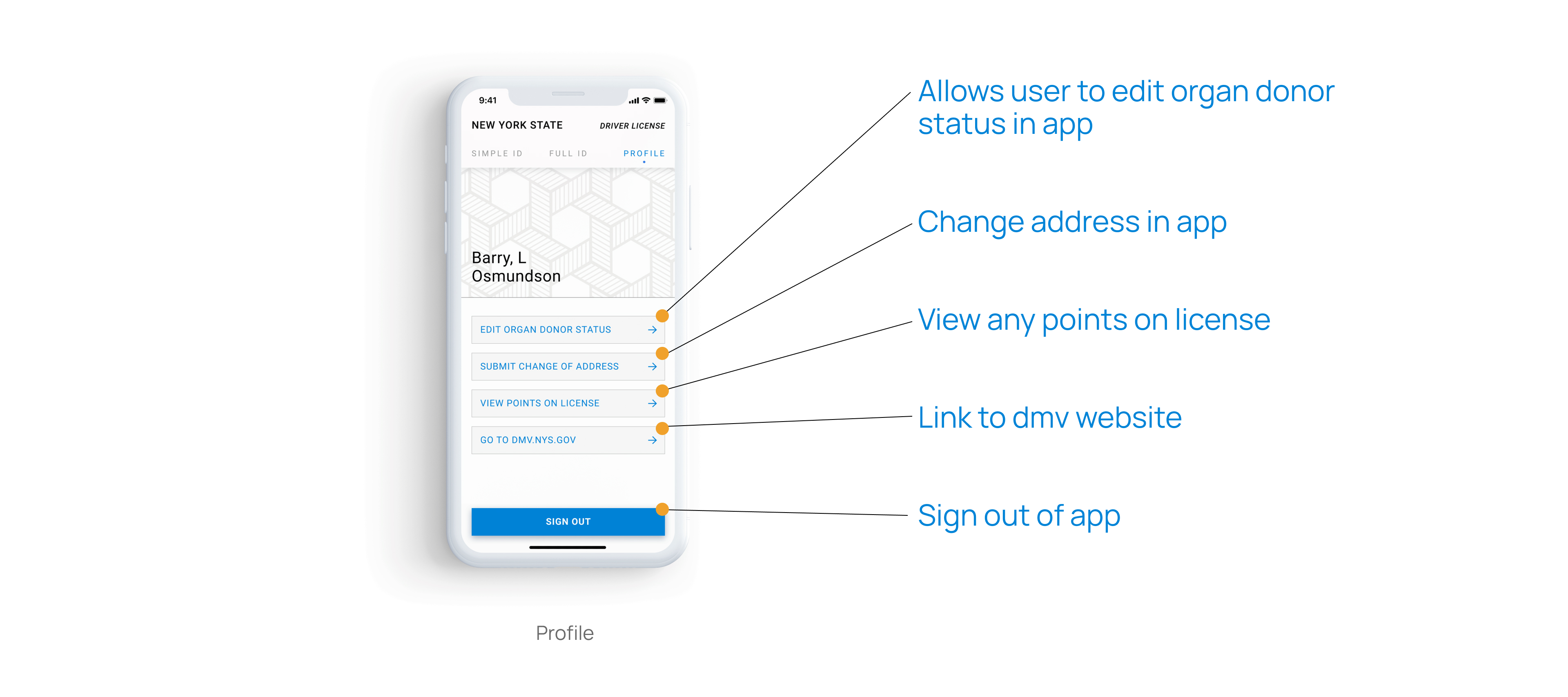
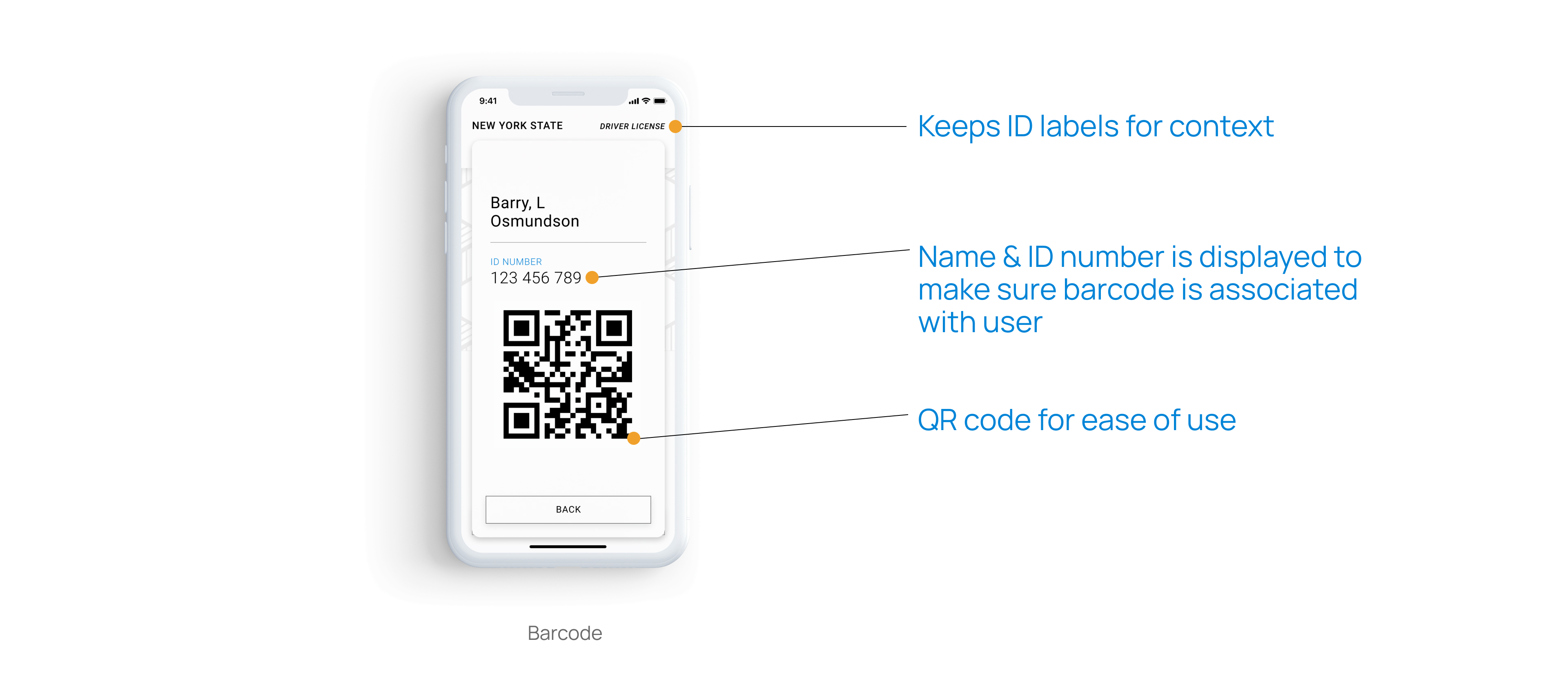
Keep user information safe and secure by hiding sensitive information when it isn't currently needed.
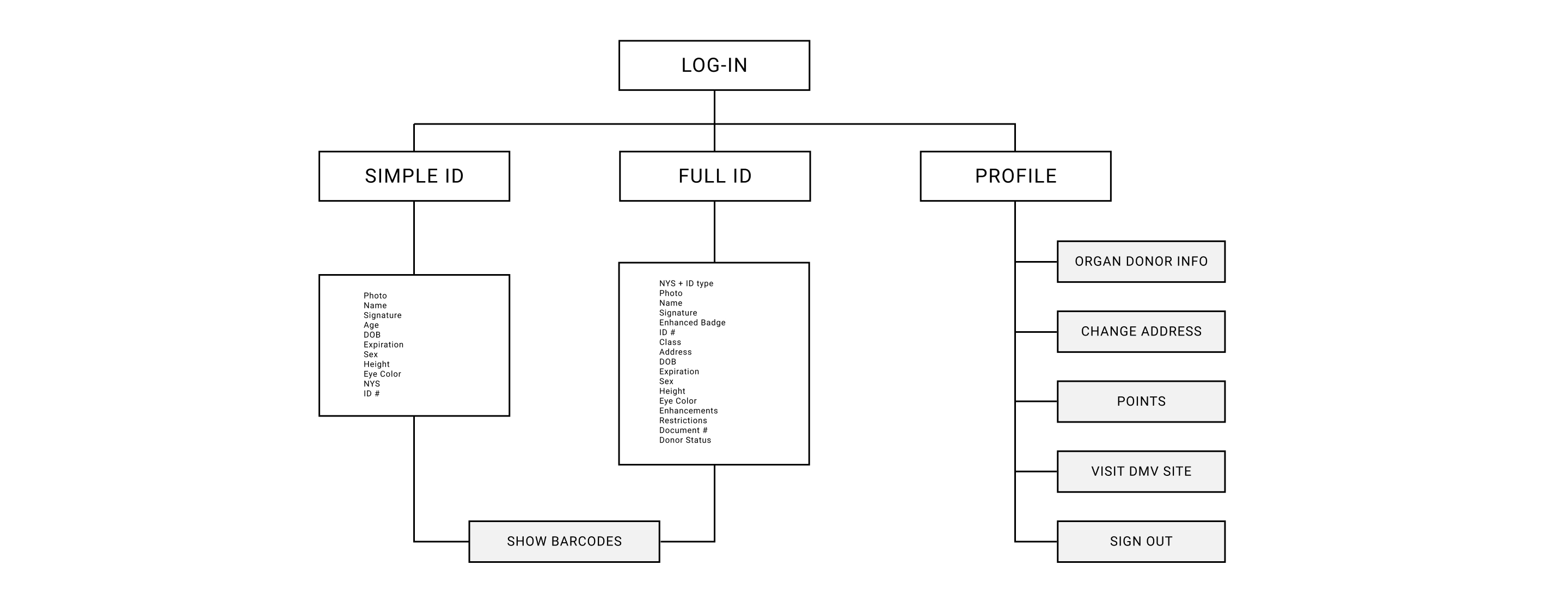
Information Architecture
Final Screens
Moodboard: Cool & Collected
EMOTIONAL
Secure
Reliable
Fresh
Utilitarian
VISUAL
Clean
Minimal
Structured
Sharp

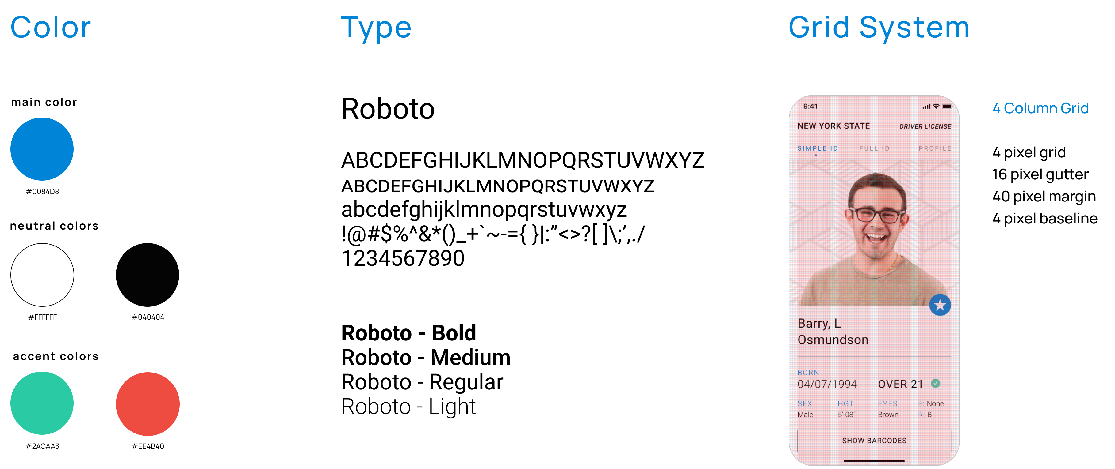
Styleguide
